Laney Photography: e-Commerce/Practitioner Website Case Study

For this project, our challenge was to design a desktop for a local business or professional. I worked with two other women on this project, Erica Cameron and Kaliah Perry. We chose Laney Photography, a photographer from Rochester New York, who just recently won The Democrat and Chronicle’s 2021 Community Choice Award for Best Photographer. Our main goal was to see if through UX Design methodology we could have a positive impact on a local business, improve utilization of the website and grow business revenues.
Timeline: 3 WeeksResearch
Our first step was a stakeholder interview with the owner of Laney Photography, Amy VanOrden. We learned some pain points that the current site had. Messages would come through with no name or email attached sometimes, leaving her unable to respond or reach out to customers and losing business. There was also no way to link her social media accounts to the site, and her social media sites are updated the most frequently. We also discovered that we needed a clearer way to show pricing and packages on the site.
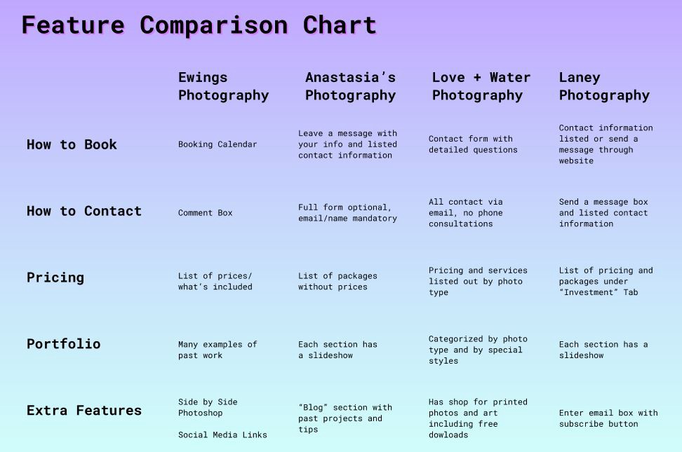
We each took a look at a few different competing photography sites, and came together to fill out a feature comparison chart. This helped give us some ideas to possible features that might improve the usefulness of the site.
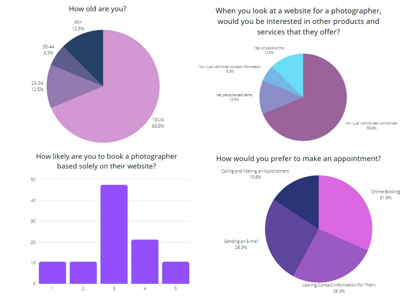
I set up a survey through Google Forms which provided a lot of valuable data. Here we were all surprised to learn that people really were not interested in other products such as personalized items. Most people just wanted to see the photographer’s work, prices and contact information.
Analyze
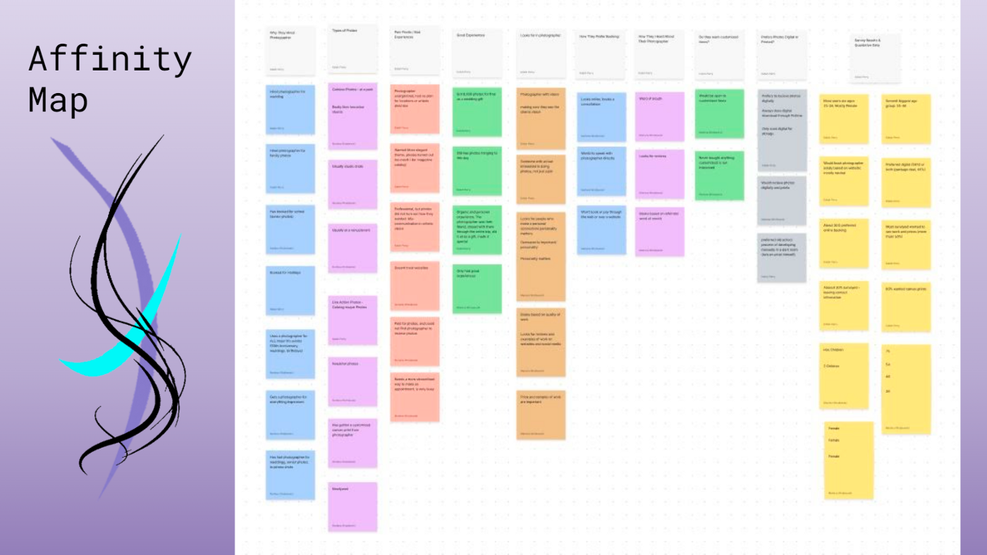
We had learned a lot so far, along with Kaliah and Erica finding more user interviews, we had a lot of information. To organize it, we all worked on an Affinity Map, which made it very easy to see everything we had all learned in one place.
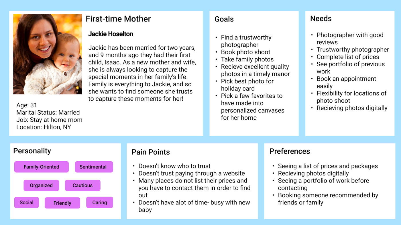
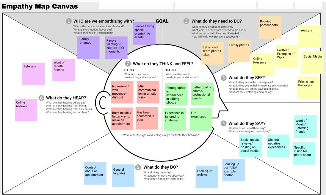
The Affinity map made many pain points very clear, so I used all the information to create a User Persona to help us really get into the mind of the customer. We also filled out an Empathy map together, which also helped really solidify customer pains and gains.
Focusing on the customer pains, we were able to come up with three problem statements. From here we voted on one to focus on.
“Busy individuals need to find a way to make an appointment quickly and easily for a photographer for special events because they don’t have time to wait for someone to get back to them or to make phone calls.”
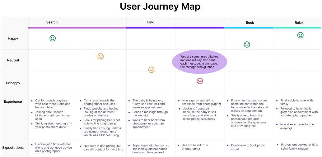
Kaliah and I worked on a User Journey Map for our busy mom Jackie who wants to book a photographer for her son to show the current process of trying to make an appointment by sending a message through the website.
Design
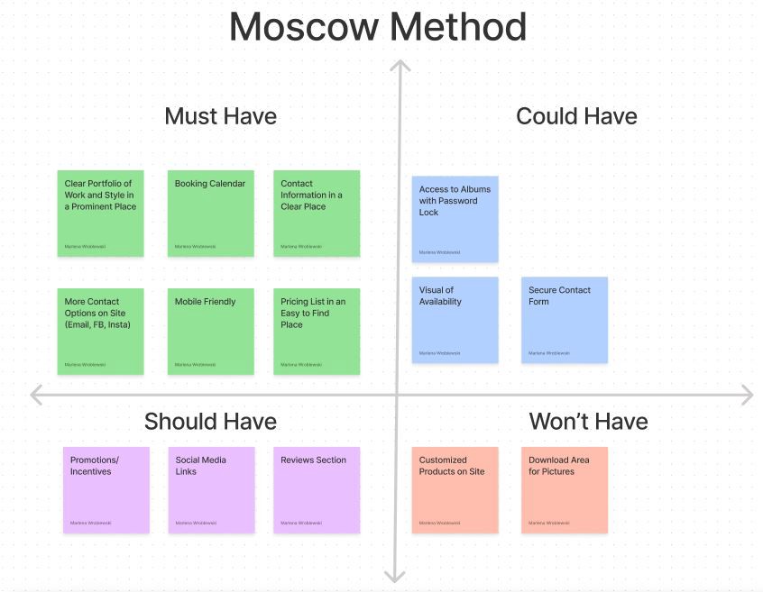
It was time to start designing the site. First we had to decide what features to add and what features we didn’t need. To do this, we used the Moscow Method, which splits features into four categories- Must Have, Should Have, Could Have, and Won’t Have. This helped make it clear which features to focus on when designing the site.
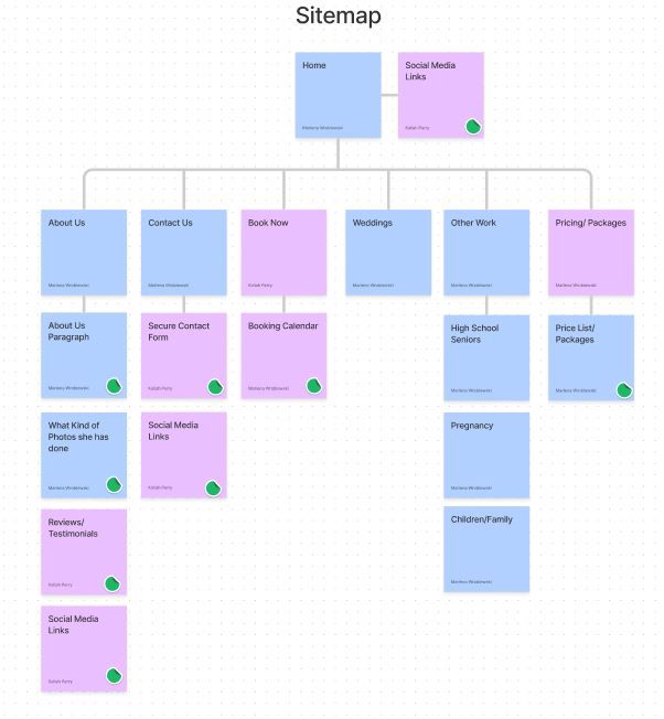
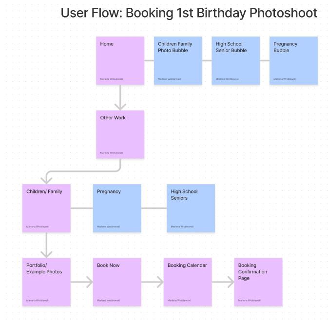
Now that we knew which features we wanted and which ones we didn’t want, we could move forward and make our sitemap and a user flow for our new feature- a booking calendar.
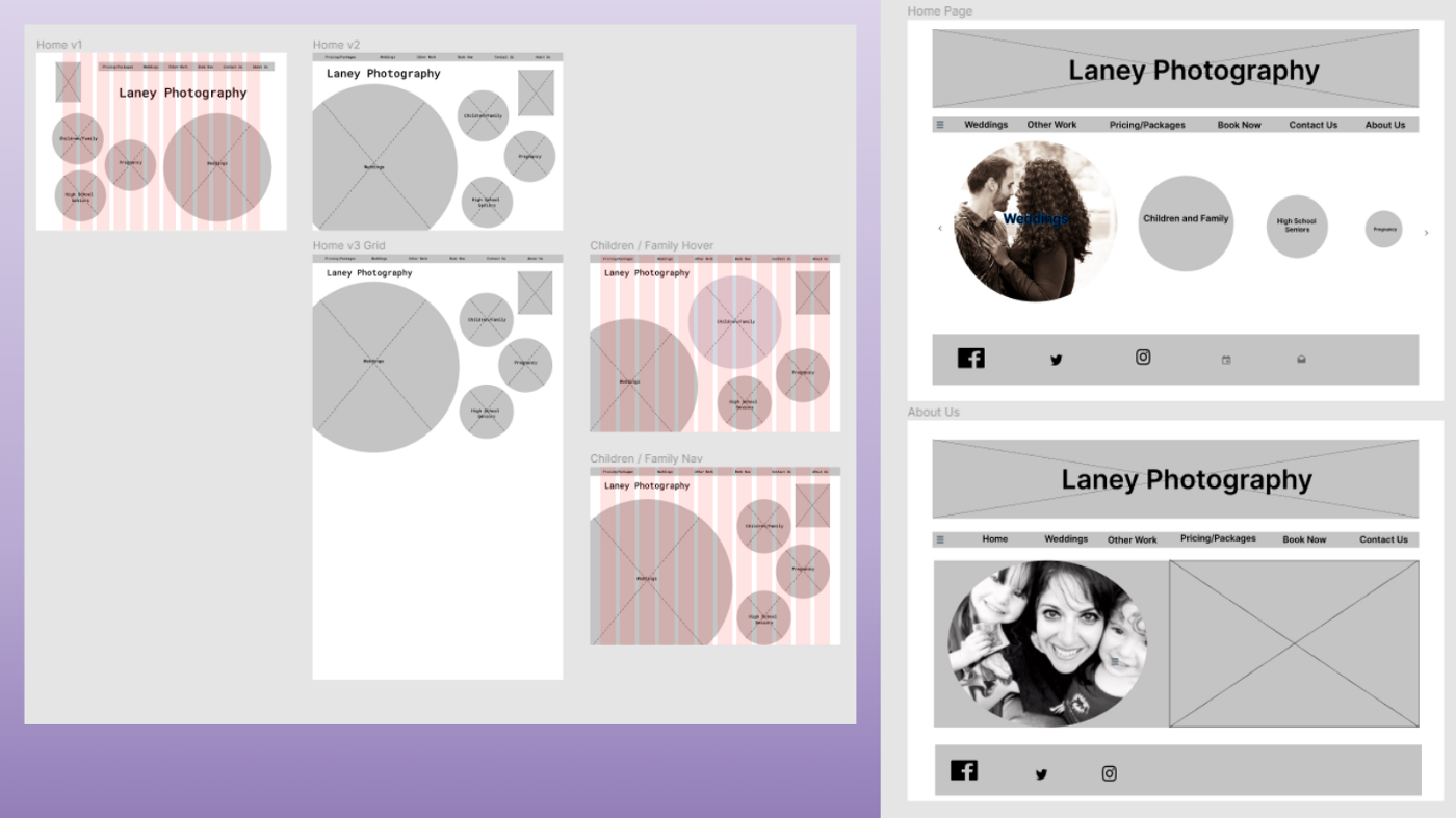
We decided for the mid-fidelity wireframe that we would each design our own separately and come together and collaborate for the final product. This really allowed us to pick the best ideas from each of our wireframes and pull them together in a really unique way.
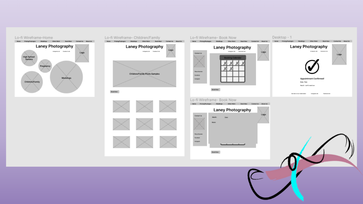
With our design being finalized, we finished up our prototype and could begin usability testing of our new feature. Based on what we learned from usability testing, our next steps would be to add a home button to the confirmation page, add a button to ‘book now’ from the pricing page to the corresponding calendar, and add a small ‘about us’ footer to the bottom of the home page.
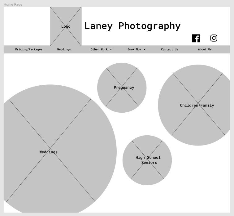
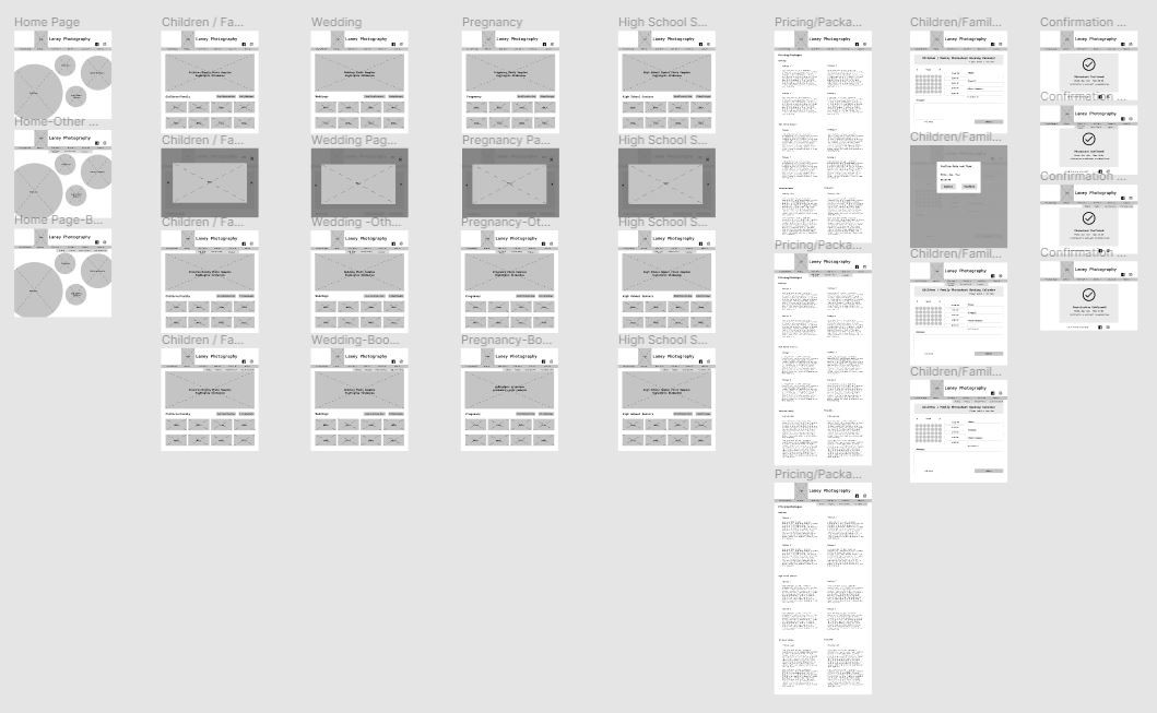
Overall our feature was very successful in usability testing, and from here we came together to design a high fidelity home page to showcase what the final site would look like.
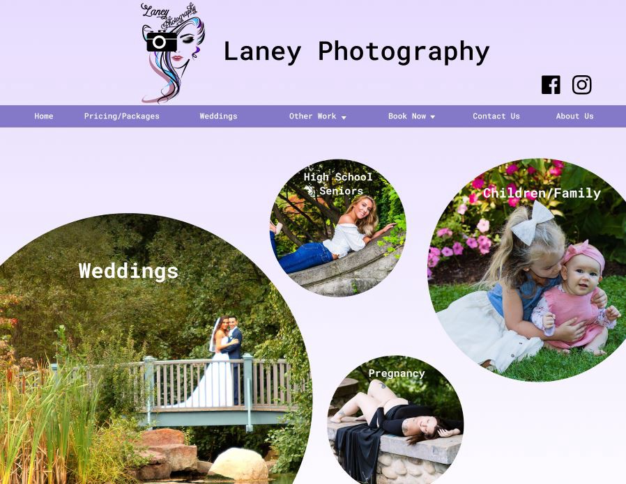
Along with this, I redesigned a new logo for Laney Photography, one that better captured the photographer’s personality.
In Conclusion
Through UX Design methodology we were able to successfully implement and test a new idea for a feature that would not only be more convenient for the customer, but also for the photographer. I am currently working on implementing this website design into a functional website with the help of a software developer, and we hope to see it live soon.
During this project I discovered that survey information can be very valuable, and I will definitely be using surveys more in the future. Something else I learned during this project was that sometimes your initial idea might turn out to be something users wouldn’t really be interested in at all, and user research is definitely vital because without it we wouldn’t have known not to move forward with that feature. The more information we gathered the more clear our direction became. This is the first time I have used the Moscow Method, but I found it extremely helpful in deciding what features to add to the site and which features we should leave out, and I plan on using it in future projects.