Wellness App- Peace of Mind Case Study
 Timeline: 4 Weeks
Mental Health is a growing concern nowadays. Many people use exercise and yoga to help with their mental health issues, but the apps on the market focus mostly on physical health.
My goal was to create a yoga app that focuses on helping people improve their mental health and build healthy habits.
Research
The first step I took was creating a survey in google forms. Then, I did some market research on four yoga apps already in the Google Play Store. I chose YoMaster, DailyYoga, Yoga: Down Dog, and Yoga for Beginners as competitors. I downloaded the apps and started by reading reviews on the play store to see if I could gain any insights.
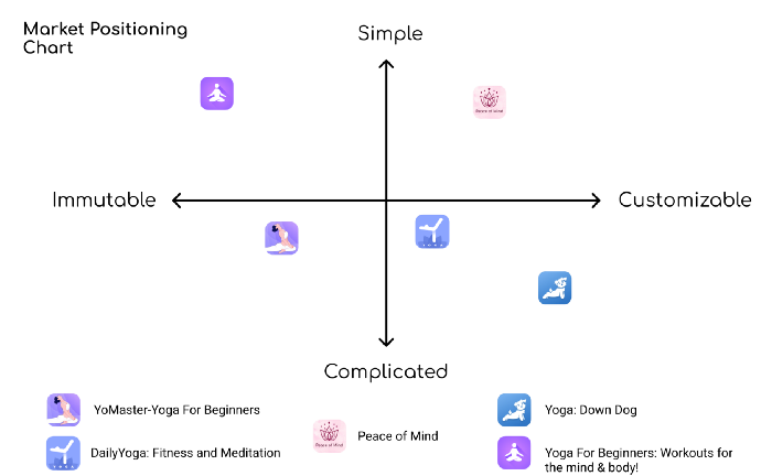
After using each of the apps and gathering my data, I created a market positioning chart comparing the apps and showing where I wanted my brand to be. There was definitely a large gap in the market that needed to be filled: an app that is simple and personalized to fit your own needs. This is where I positioned my app, Peace of Mind, because that was my goal.
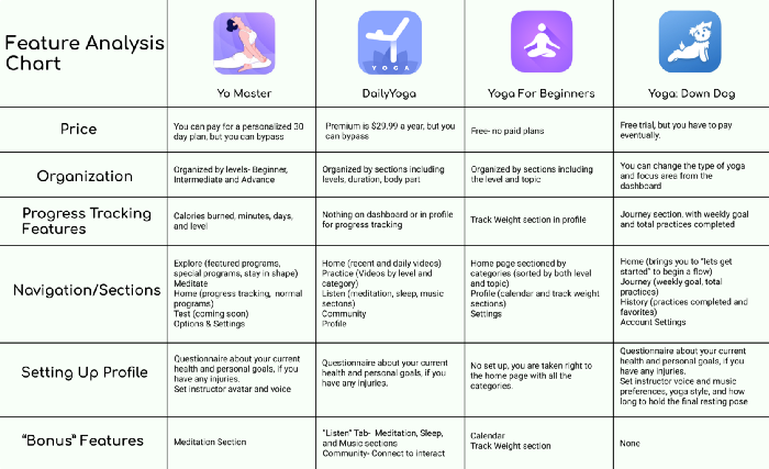
After spending more time using the apps and seeing what they had to offer, I created a feature analysis chart. I broke it down by how much they cost, organization/navigation, how they set up your profile, and any bonus features they might have.
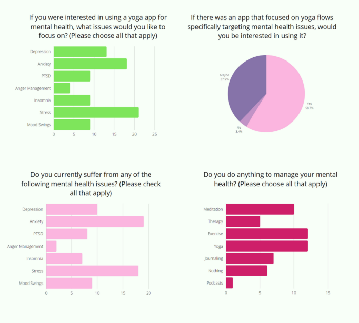
My survey results validated that people would be interested in using my app, and also provided good insights into which areas to focus on concerning which mental health topics to cover.
Analyze
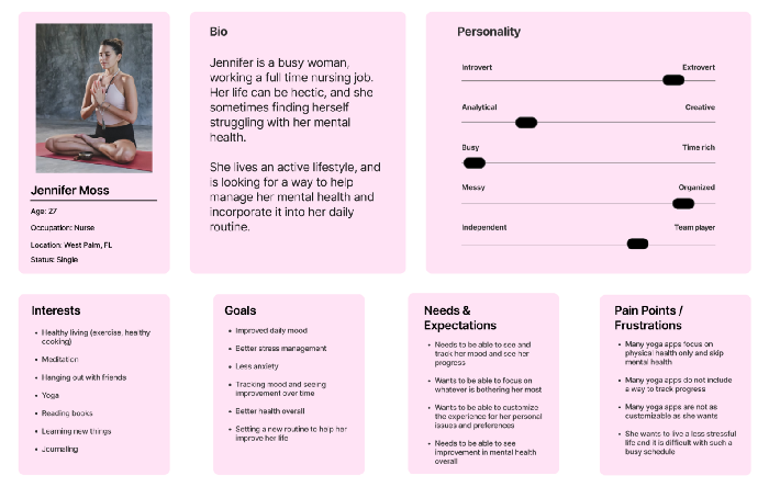
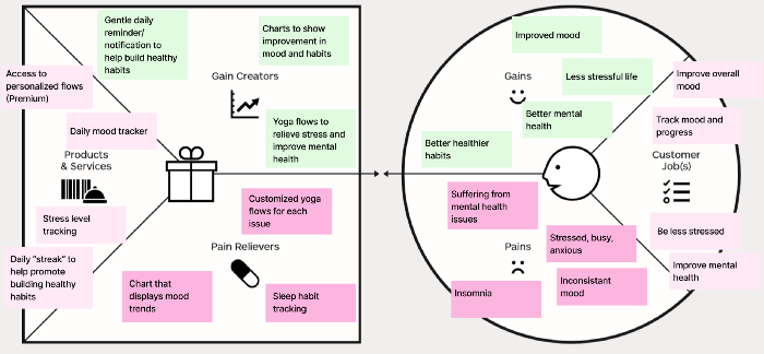
Using the information I gathered in my survey and in a few user interviews I conducted, I Created an Affinity Diagram. I then used this information to create an Empathy Map to further showcase who I am building for, their pains and their goals. My next step from here was to make a user persona based off of everything I had so far, to help me better empathize with the users and keep me on the right path.
After I made my user persona, I created some user stories to focus on. Users want to be able to track their mood and habits so they can see improvement over time, users want to be able to choose areas to focus on so they can get the best flow for their personal needs, and users want to be able to customize their experience to best suit them.
My next step was gathering up my data into a Value Proposition canvas to show the problems Peace of Mind will solve for users and some of the features it should have. I used the pains and goals from my Empathy Map to start with to show the needs of the users that are being solved.
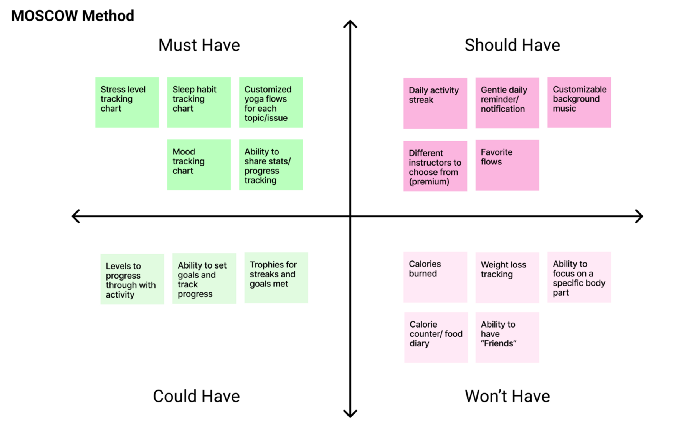
After I made my canvas I moved on used the MOSCOW method to decide what features the app will and won’t have. From here I decided that the app must have a stress level tracking chart, sleep habit tracking chart, a mood tracking chart, customized yoga flows for each issue, and a way to share stats/progress.
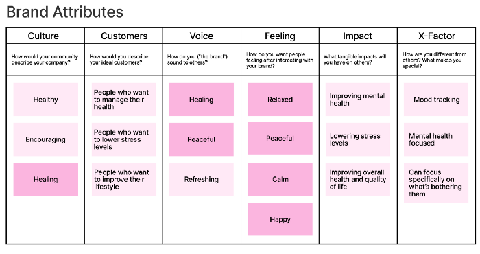
Now that I knew which features I was including and which I was leaving out, I moved on to filling out a brand attributes chart for my brand. Using this chart, I was able to determine the top five adjectives that describe the brand; peaceful, calm, relaxed, happy, and healing.
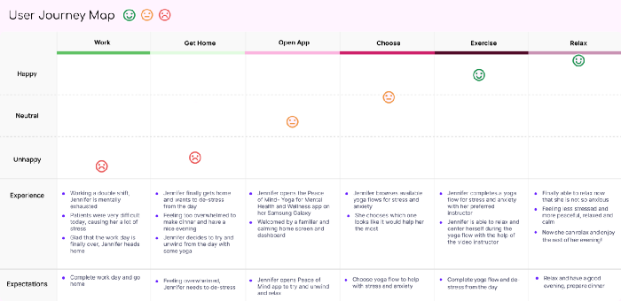
Next, I wanted to demonstrate how Peace of Mind could improve someone’s daily life, so I created a User Journey map. This map shows Jennifer coming home from a very stressful day of nursing, opening the app and completing a yoga flow for anxiety and stress, and feeling much more relaxed and happy afterwards.
I then made a User Flow chart for a few different flows within the app, initially setting your profile up and opening the app and completing a yoga flow. This helped me start to plan out how I wanted the app to flow during set up, and made things much easier when I moved on to the prototyping stage.
Design
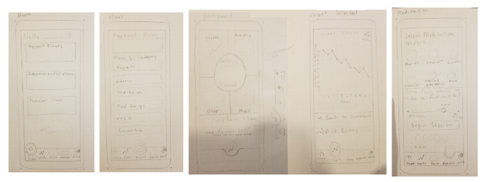
With a basic layout of how I wanted the flows to go, I began to sketch some concept sketches of how I wanted each page to look.
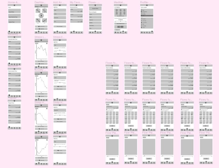
After doing some brief concept testing, I turned the sketches into a mid-fidelity prototype in Figma.
Usability testing revealed that things are in a logical place that is easy to find, it is easy to navigate in general, and each flow was completed successfully without any assistance needed. One user suggested adding an option to share to twitter as well, which I made a note of. Overall, testing showed that I could continue to move forward into high fidelity prototyping.
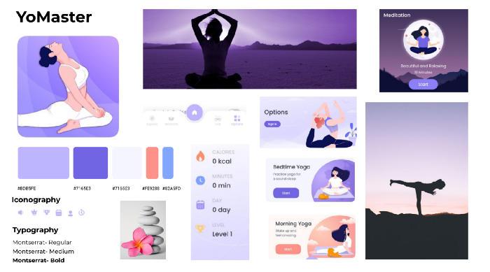
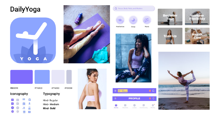
Before moving into high fidelity, I did some visual competitive analysis for two of the competing yoga apps I installed, YoMaster and DailyYoga. My research and analysis showed me some very interesting things; rounded shapes feel more relaxing/inviting, many yoga apps use purple as their main color (3 out of 4 apps I installed to research used purple), mostly all of them had light relaxing colors used as a background with a pattern of using pastel and soft colors in general.
Now it was time to focus on my color palette, so I made some mood boards to choose from, each with a different feel and color scheme. Taking into account my visual competitive analysis, which revealed that many yoga apps use purple as their main color, I made a fourth mood board and chose more of a pink and green theme.
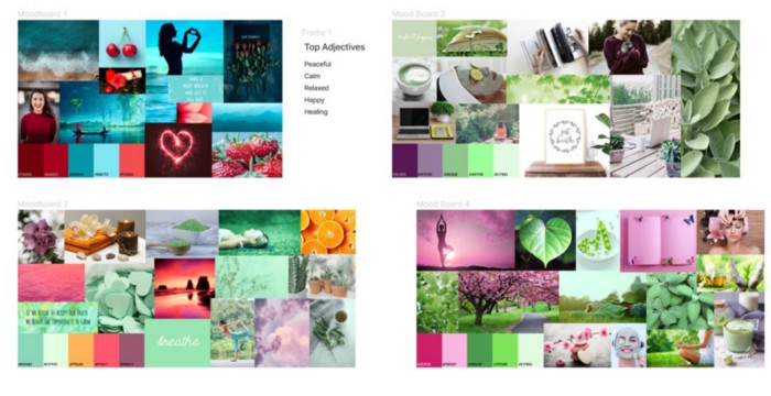
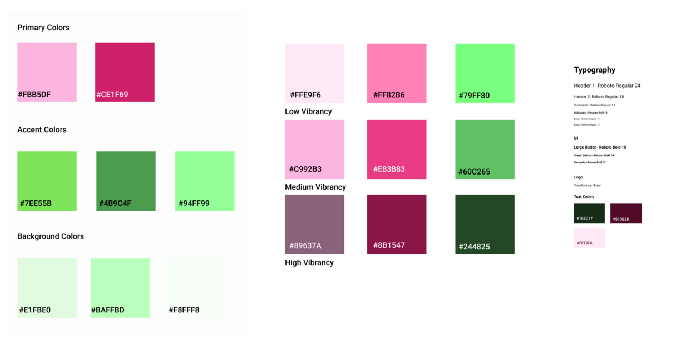
I did a small desirability test on which mood board was the most popular, and which mood board best fit our brand adjectives, and the results showed people preferred the fourth mood board with the pink and green. Based on my discoveries from my research and desirability testing, I decided to move forward using that as my color palette, and implement the new colors into my design.
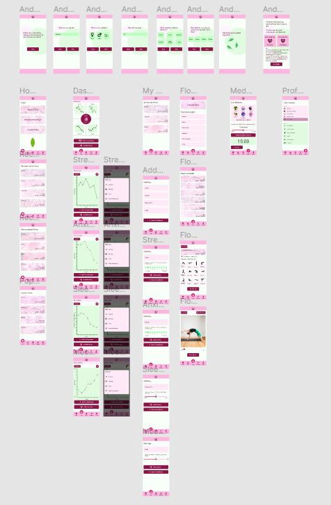
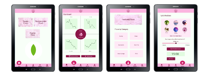
As well as creating an interactive prototype for an android phone, I also created how it would be displayed on a tablet as well.
As I worked on my design, I kept visual design documentation of the colors, typography, and components that I used in my design as well, using the Atomic Design methodology. I always try to implement this methodology, as it makes things very easy to change if need be, and building something new is much faster. I also documented the icons I designed for the app and the ones I used from the Material Design 3.0 library.
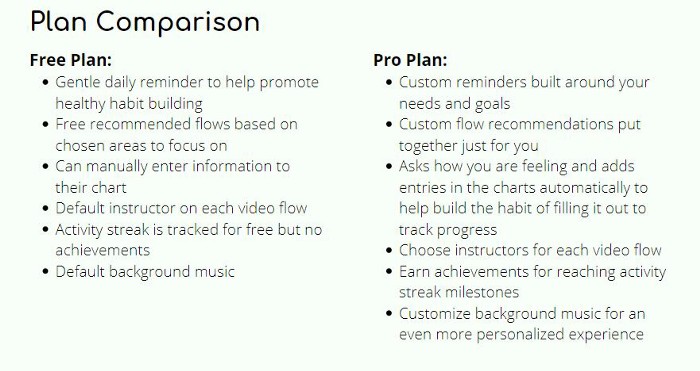
Now that my prototype was ready for testing, I decided to finalize the different plans the app would offer, a free plan and a pro plan (a paid membership).
I will know my app was successful if there is an increase in accounts on Peace of Mind by at least 10%, if we can see a trend of users anxiety and stress levels lowering by at least 10%, and if the number of users who convert to the Pro plan increases by at least 5%.
The next steps I would take with this project in the future would be to perform more usability testing on the hi-fi prototype, to add more categories to focus on for flows, to implement a way to display achievements earned (if using a pro plan), and figuring out a way to link your charts directly with your coach or therapist so they can see live metrics at any time.
In Conclusion
This project taught me a lot about project management. I learned that when given a large project with many steps involved, it is important to manage your time wisely to be sure everything gets done. I discovered that Trello is a great resource to plan a project and set yourself dates and deadlines, and I will continue to use it going forward. It keeps things very organized and helped me balance my workload so I could get it all done on time. I also found that keeping a journal of my steps as I went along made it much easier to gather my thoughts for the final presentation and writing my case study. I am much more confident in planning projects in the future.