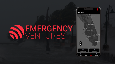
Emergency Ventures-Mobile Web App Case Study
 Timeline: 4 Weeks
Emergency Ventures is a startup company founded in 2017 by Joseph Russo, Sven Hermann, and Leah Halbina and is based in West Palm Florida. Their goal is to connect and assist as many citizens, volunteers, and emergency managers in disasters as possible.
My goal was to make an “Evacuation Portal” web app so that in the event of a hurricane striking Florida, Citizens can use this portal to gain knowledge and make decisions using the provided data.
Research
For my first step in this project I prepared some questions for my stakeholder interview and did some preliminary research on hurricane preparedness. The interview revealed a lot of valuable insight into what the company’s goals and values are.
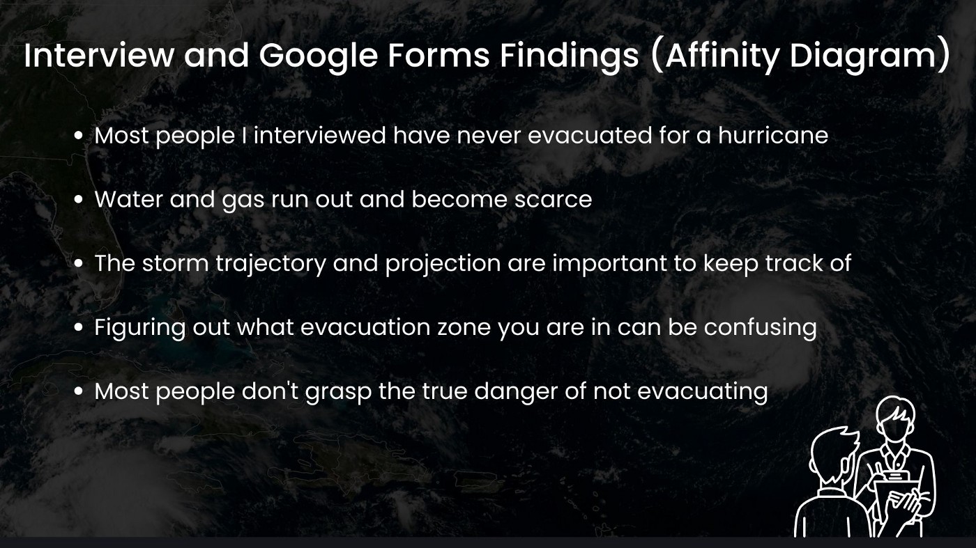
To begin my user research phase, I started to interview people who had been in hurricanes or been affected by them before. I also sent out a survey I made using Google Forms to gain some further insights. After I gathered all of my data, I organized it into an affinity diagram which revealed some key findings.
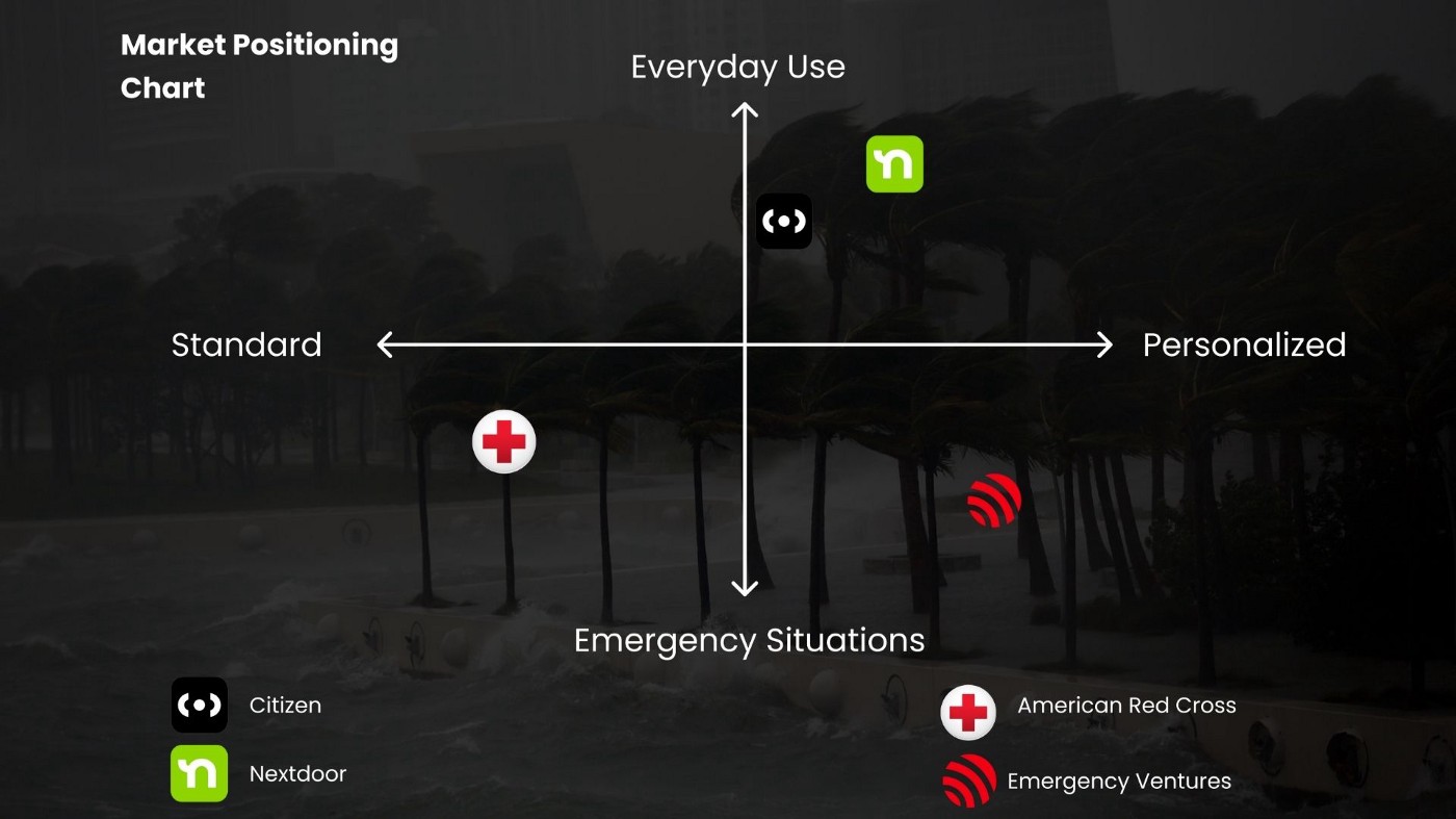
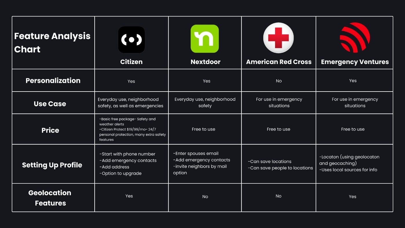
Next I moved into the competitive research phase. I looked at Citizen, Nextdoor, and American Red Cross. After looking into all of the apps I organized it using a market positioning chart. This really made it clear that there are not really any personalized apps for use in emergency situations, and Emergency Ventures fills that gap.
I also created a feature analysis chart during this phase of research. This further showed that Emergency Ventures was the only app for emergencies that could be personalized and used geolocation.
Analyze
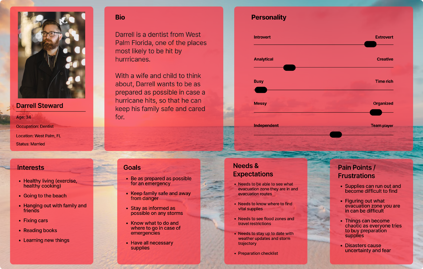
My next step was to take what I learned in my survey and in the interviews and use it to create an empathy map. This allowed me to really flesh out the users needs and goals, as well as pain points. Now that I had all of my data organized, I used the empathy map to create a user persona. This allows me to further empathize with the users and make sure my design stays centered around them.
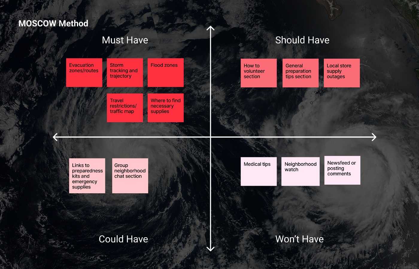
The next stage was to decide what features the webapp would have. In order to do this I used the MOSCOW Method. This is a methodology where you create a chart with four sections: Must Have, Should Have, Could Have, and Won’t Have. This helps to visualize and prioritize features.
Now that I knew which features to move forward with and which features we would not include, I made a value proposition chart to showcase how the included features would solve users problems and fulfill their needs.
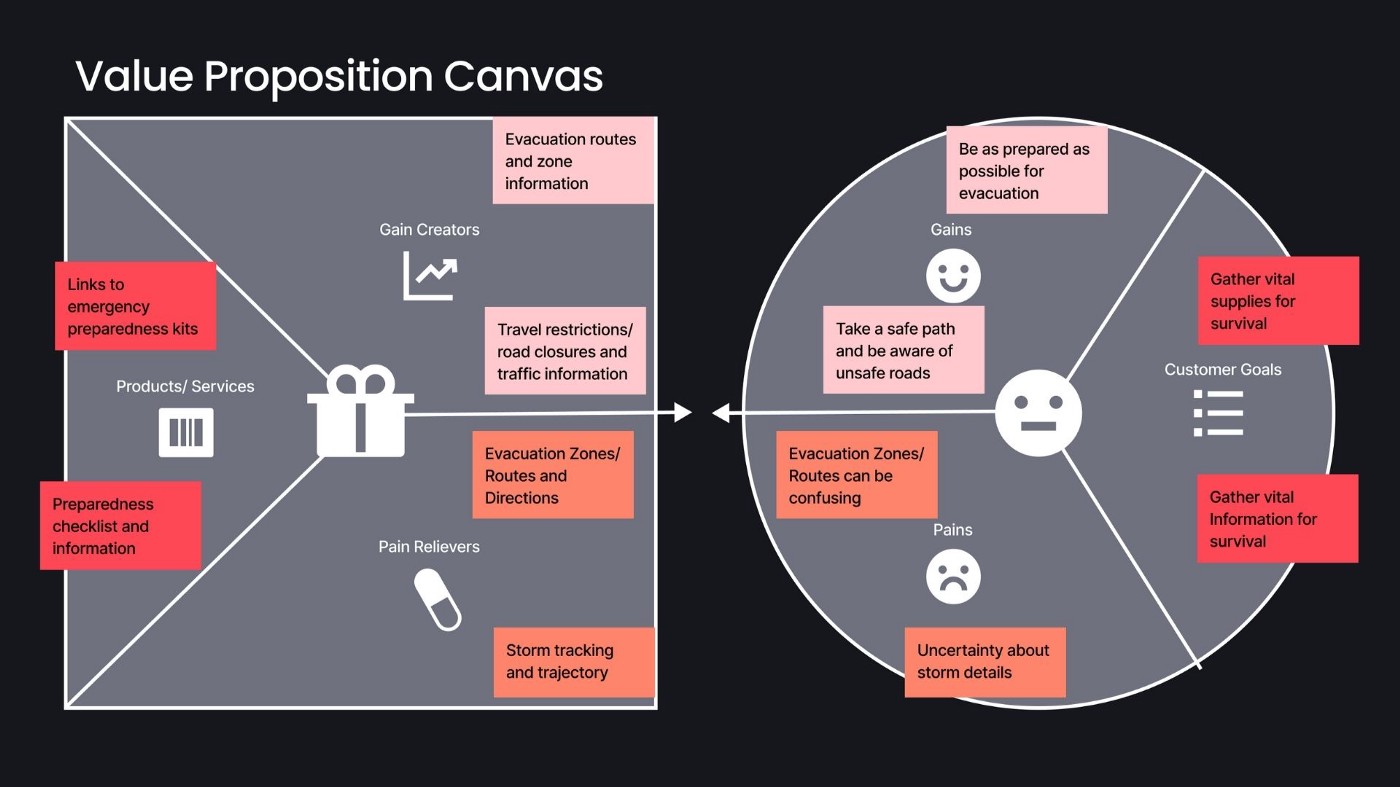
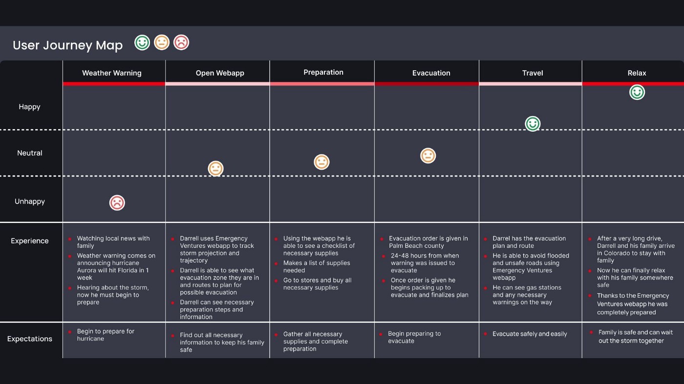
The users want to be as prepared as possible for an evacuation, and they want to take a safe path and be aware of unsafe roads and incidents. Emergency Ventures webapp will show evacuation routes and zone information, and will show travel restrictions and road closures as well as traffic information, so users will be as prepared as possible.
Some pain points users have are both the uncertainty about storm details, and the fact that finding evacuation zones and routes can be confusing. The webapp will show evacuation zones and routes clearly, as well as display storm tracking and trajectory, easing these pain points.
Using my persona, Darrell, I created a user journey map. This showed how the Emergency Ventures webapp would improve his experience, making it smoother and more positive overall.
Design
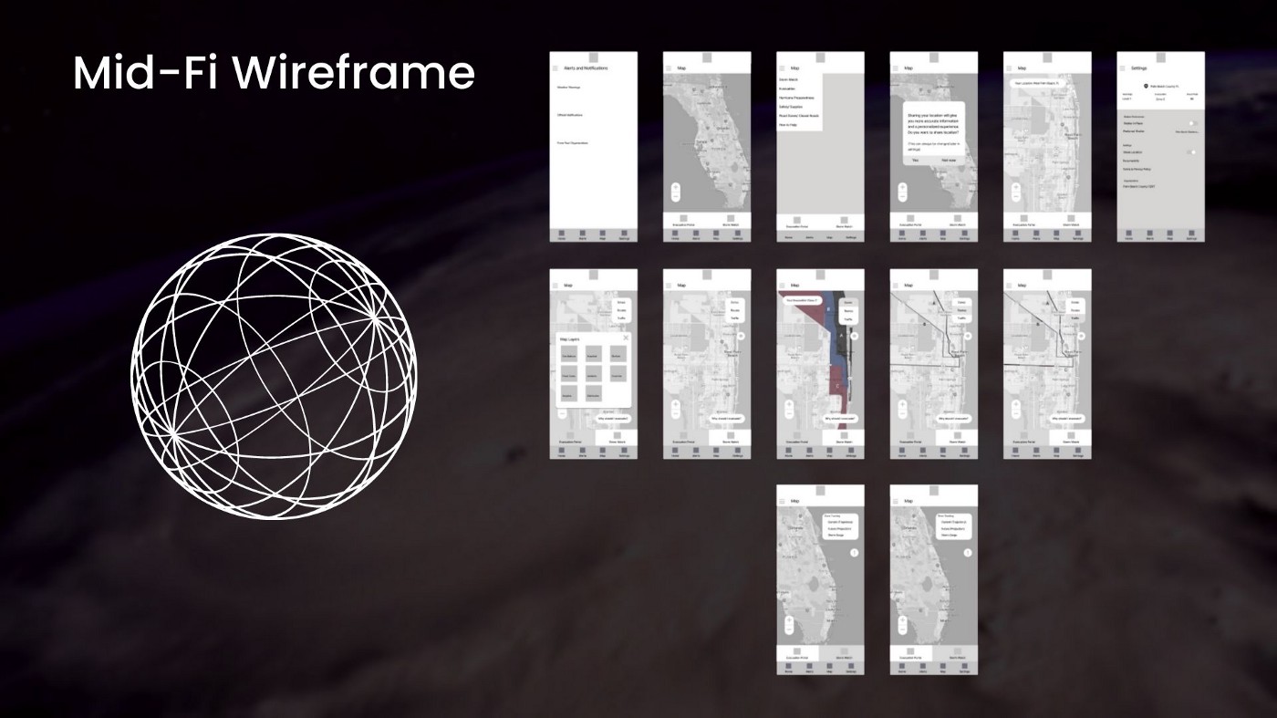
Now it was time to move into the design stage. I was able to do some concept sketching and move into my mid-fidelity wireframe, which I based off of the sketches. From there I was able to perform some usability testing on my mid-fidelity prototype before I moved into my high fidelity design.
The usability testing at this stage revealed that the webapp is easy to navigate and things are in a logical place. Each flow was completed successfully without any outside assistance needed. One user made a suggestion to add the option to share your location if you are stuck and need assistance.
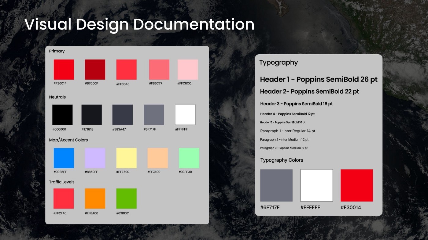
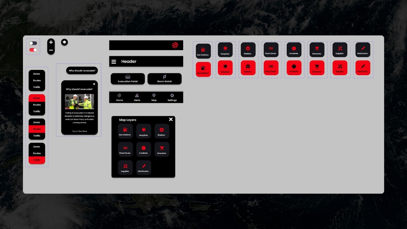
Now that the usability testing was completed with no issues, I moved into the high fidelity stage of design. I kept visual design documentation which followed the company’s branding and style guide. I also organized my components into the style library.
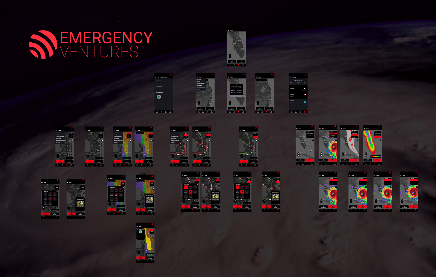
Following the style library and Emergency Ventures branding, I completed the final design for the high fidelity prototype: The Emergency Ventures Webapp for mobile.
In Conclusion
We will know we were successful when we see an increase in evacuations in an emergency by at least 15%, if users can evacuate at least 10% more efficiently than before, and if the pain points of preparing, evacuating, and tracking the storm decrease by at least 20%.
The next steps in this project would be more usability testing on the hi-fi prototype, looking into adding an option to share your location if you are stuck and need assistance (as suggested in usability testing), and doing more research and interviews with feature users. I will be continuing to work alongside with Emergency Ventures to help them flesh out this concept even further.
This project was a great experience for me, working with a company that helps people and having the chance to positively impact lives is absolutely amazing. I really got to know Trello for my project management and planning, and I will continue using this method in future project planning.